You famously get only one chance to make one—and in dentists’ case, that means presenting an alluring, beautiful, clearly functional entryway and front of house. Just like these four practices have done.

Drafts and laughs: (From left) Benco Dental Design Team’s drafting specialist Ron LaLunio, interior designer Taylor Haight and design manager Sucharita Ray
WHETHER YOU recall a certain experience from your past as blissful or disappointing, you likely remember minute details about it. Psychology Today explains this as your brain taking “first-impression
Polaroids that form an impression larger than their sum” and “capture elements of truth.”
(If you’re under 40, ask an older patient what a Polaroid is.)

Interiors expert Sucharita Ray, design manager for Benco Dental, here explores the look of four practices, taking them in toto but focusing on the entryway—that crucial initial glimpse. “Research shows it takes 10 seconds to form a first impression,” Ray says. “In a dental practice, that impression would be what visitors see from the front door, the parking lot or, in the case of a potential patient, even from the street. In most cases, even if your service is impeccable and you’re well-seasoned in your craft, patients’ first impression stays with them.”
Her guidance for dentists: Align your own first impression to be consistent with your practice values, vibe and the patient base you aim to attract. Is your Pinterest page open? Ray—known informally as “Suchi”—explores the elements that accomplish all this well at this quartet of stylish practices.
 Instant Karma
Five ideas for creating a positive first impression.
- Feature your logo where it will be seen upon entry. If a new patient has noticed your logo on your website or outdoor signage and recognizes it when they walk in, it reinforces that they’re in the right place.
- Denote a clear entry point for visitors as soon as they walk through the door. A greeter or simply an intuitive pathway should direct them to sign in. Some patients, if they’re unsure of where they ought to go, will consider the practice poorly run and leave.
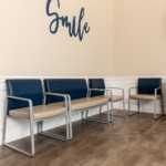
- Create several seating pods if your space allows. (Insider tip: Use the same chairs, but with varied upholstery.) Establish zones that are family-friendly or adult-friendly so patients, especially those with social anxieties, don’t feel forced to sit next to a stranger. Imagine an introvert seated next to someone prone to asking personal questions.
- Offer beverage service, keeping in mind CDC guidelines. One idea: a simple concierge service at sign-in, such as an offer of water or soda by front-desk personnel. (Insider tip: Coffee will require additional staff effort until practices can safely reinstate self-serve beverage stations.)
- Install acoustic treatments over the front desk so check-in conversations can’t be heard by others in the reception area. Consider piped-in music, overhead white noise or architectural elements such as a drop-down soffit, acoustical tile or paneling.
Spa Session
Charlestown Dental
Malvern, Pennsylvania
DR. PALAK JAIN describes her personal design sensibility as “simple sophistication,” and the entry of her Philadelphia-area practice reflects it.
“Our inspiration for the construction and design was based on the realization that people dread going to dental offices, and we wanted to change that notion—both from the facility and the personnel perspective,” Dr. Jain says of the 1,500-square-foot space. “We wanted patients to feel welcome and comfortable as soon as they step in.”
She took her vision to heart in the matter of site selection (“a new and upcoming residential neighborhood”), architecture (“a barn design with high ceilings”), operatory design (“soothing colors with two TVs for patient entertainment”) and that modern lobby.
As with any project launched in 2020, the pandemic butted in: The statewide lockdown in Pennsylvania halted construction, and delays ensued in obtaining permits, furniture and fixtures. Forced to adjust their timeline by nearly six months, Dr. Jain and her associate Dr. Biju Paul began welcoming patients last August to the new facility.
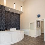
A three-dimensional accent wall is a striking feature in the entry area as well. “We wanted vibrancy and variety, not boring and mundane,” Dr. Jain says. “We wanted to build an office that had a wow factor as soon as you enter—not a spa but not a dental office, either. Something of a hybrid.”
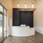
“With this well-placed front desk, there’s
no question for a patient entering the office. A lower counter for ADA accessibility is very well-appointed.”
If patient happiness ensues, well, the aesthetics of the place—augmented by team excellence—are doing their job. “The most important contribution to a first impression is the overall patient experience, from the first phone call to the post-visit follow-up,” Dr. Jain says. “We have a tremendous staff that goes above and beyond to meet patients’ needs and make them feel welcome and valued.”
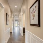
“Natural light streaming in creates a warm, welcoming space that’s relaxing for a reception area. That combined with the high ceilings eliminates the need for artwork.”
Design Tip!
Always use a contractor who has experience with dental-office construction. A general contractor is not a good choice. Make sure your equipment rep and contractor communicate; you’ll suffer if they don’t. And work within your budget—it’s extremely easy to overshoot without planning.” —Dr. Palak Jain
The Team
Photographer: Greg Benson, gregbenson.com
Interior Design: Sumeet Jain, Charlestown Dental
Contractor: Real Services, York, Pennsylvania
Architect: Sumeet Jain
Dental Designers: Real Services, York, Pennsylvania; Amanda Griffith, Benco Dental
Equipment Specialist: Mary Robbins
Friendly Benco Rep: Cathy Neikam
Online: charlestowndental.org
Dental Utopia
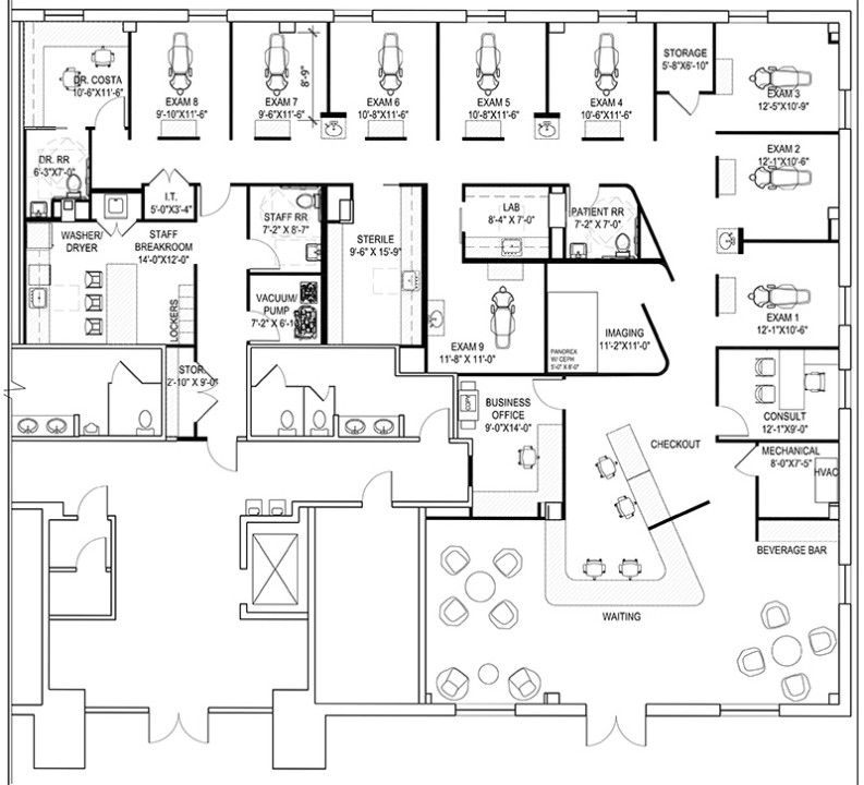
Costa Dentistry
Great Falls, Virginia
DR. SHANE COSTA and Sir Thomas More both posited the existence of utopia, but only the award-winning dentist has seen his vision take corporeal form for patients in Great Falls,
Virginia. (Take that, Sir Thomas More!)
“I wanted to create a space that sets us apart,” Dr. Costa, 44, says. “The dentist isn’t anyone’s first-choice destination, so I wanted a place that’s interesting to visit and comfortable.” The 50-inch televisions on the operatory ceilings and the massaging dental chairs would seem to fit the bill.
“The reception area is well-thought-out, from the different types of lighting that add interest to the black walk-off carpet in the front-desk area that restricts outside elements from soiling the white floors.”
Like others featured here, Dr. Costa found his best-laid plans for 2020 brought low by the pandemic, which delayed him about half a year. “Our time frame was completely thrown off,” he says. “All in all, it worked out for the best, as it allowed us to make changes to our design to account for pandemic-related issues.
“We installed the highest-quality air filters and sanitation systems,” he continues, “and designed the flow of the office to allow more space for people to spread out.”
It all starts, of course, in the welcome area upfront. Dr. Costa describes the vibe as “spa-like,” intended to make patients “more relaxed the moment they step in. The serene, clean, modern design lends a calming effect.”
Dr. Costa has received a number of industry accolades, such as inclusion in the 2015 Incisal Edge 40 Under 40. Yet he’s quick to extol the talents of those around him, from his design team to his colleagues at the practice, Drs. Neha Garge, Jean Kim, Shafia Tariq, Bella Nguyen and Brandon Meyers. “I was fortunate to work with architects and designers who truly understood my vision and my taste in design,” he says. “I knew what they wanted, and they made it happen.”
This pragmatist, it seems, has been well-served by his perpetual optimism, too. “Dentistry is not an easy profession—you’re a doctor, artist, psychologist, project manager and customer-service professional,” he says. It takes a lot of perseverance, but have a vision and go for it. When you have a beautiful office to be proud of, it makes all your hard work much more meaningful. My vision on this was clear years ago, and I’m so happy that we were finally able to bring it to life.”
“A soffit with layers of lighting and a prominently displayed logo attract visitors to the front desk. The soffit also serves a functional purpose, housing the acoustical treatment used to create speech privacy.”
 Design Tip!
Follow your vision. Stick with the plan. Dentistry has overcome two major health crises, HIV and Covid-19. If you can gain patient trust by creating a safe environment, the sky’s the limit.” —Dr. Shane Costa
The Team
Photographer: Greg Powers Photography
gregpowers.us
Interior Design: GTM Architects, Megan Milawski
Contractor: Liberty Construction
Architect: GTM Architects
Equipment Specialist: Scott Gorsuch
Friendly Benco Rep: Scott Jack
Online: costasmiles.com
All Dressed Up
Bow Tie Dental Studio
Brooklyn, New York
A QUIET SPOT overlooking Manhattan across the East River is what visitors to Bow Tie Dental Studio, located in the North Williamsburg neighborhood of Brooklyn, will find upon entry. For Dr. Nina Kokilashvili, who had a hand in almost every inch of the design, a meditative, sophisticated space was exactly what she was looking for.
“The idea was to create a unique atmosphere and for the practice to have its own character,” she says. “I wanted it to stand out, be unconventional and at the same time offer a relaxing and welcoming tone. “From the moment I saw the space, I knew it was the one I would build my practice in.”
“What strikes me most is how well-grounded the design is to its surroundings. They’ve incorporated the modern industrial setting. When someone walks in from outside, it feels like a fit. The use of wood, concrete and metal keep with the city’s theme.”
Her own first impression—the location, the building, the overall ambience—was one Dr. Kokilashvili, 44, sought to share with her patients. “As the space was already great, with massive windows and high ceilings, I wanted to have it simple and functional at the same time,” she recalls. “Therefore, I needed to design everything on my own: the cabinets, the sterilization room, the reception [area], the light fixtures.”
The resulting space works and flows so well that it’s hard to believe that Dr. Kokilashvili, along with her project manager (and husband), George Kvijinadze, accomplished the project on a limited budget and under the additional duress of doing so during the pandemic. Her timing was less than auspicious: “A month or two after we signed the lease, everything closed down,” she says. “Luckily, my building allowed work, and my [contractor] had already bought and delivered the materials necessary to start.” She signed the lease in January 2020; the first patient stepped through the door in September.
Her diligence and tenacity echoed those she exhibited throughout her path to dentistry. As a teenager in the Caucasus nation of Georgia, “I always knew I would become a dentist,” she says. “It wasn’t an easy road, as I had to immigrate to the United States and start pretty much everything all over.” She received her degree from the University of Pennsylvania School of Dental Medicine.
“Sometimes modern industrial can feel too edgy, but not here, with the soothing accents such as candles and plants. Wavy light fixtures and under-cabinet LED lights at the bottom of the reception desk soften the look.”
In selecting Bow Tie’s prevailing aesthetic, color choices were paramount. “I’d buy many paint colors and test them on the walls,” Dr. Kokilashvili says. “Nothing too flashy, but I didn’t just want black-and-white either. For the cabinets,
I decided to mix brass and faded-green colors.” The proof is in the eye of the beholder—all those who pass the threshold into this beautiful practice. Her team, Dr. Kokilashvili exults, “was very helpful and patient with me. As a result, everything came out as I had envisioned.”
 Design Tip!
Plan, plan and plan ahead. Not every single detail can be predicted, but at least one will know how to look for alternatives.”
—Dr. Nina Kokilashvili
The Team
Photographer: David Benthal, davidbenthal.com
Interior Design: Dr. Nina Kokilashvili
Contractor: QI Construction
Project Manager: George Kvijinadze
Architect: Eugene Khananov Architect
Dental Designer: Dr. Nina Kokilashvili
Equipment Specialist: Roman Yampolsky
Friendly Benco Rep: Rachel Finkle
Online: bowtiedentalstudio.com
Shell Game
Brand Dental
Kingston, Pennsylvania
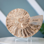
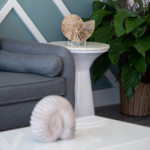
BEAUTY, SACRED GEOMETRY, grace amid growth: All are attributes of the exquisitely lovely chambered nautilus sea creature. For one dental trio in northeastern Pennsylvania, the nautilus “set the tone for every sequential step in the design process” of Dr. Stephen Brand’s new office.
The doctor, 27, explains the meaning it has for him, his fiancée, Kylee Failor (a hygienist), and his father, Dr. Charles Brand, also a dentist. “The nautilus shell is an example of the ‘Golden Proportion,’ ” he says. “Nature repeats this ratio in sunflowers, your fingerprint, DNA and the spiral shapes of galaxies. It also does so with the human smile. I use [the proportion] every time I do a cosmetic case to make sure my results are in perfect harmony with the rest of the body.”
Not long after his residency in South Carolina, he found this 3,600-square-foot space in the Scranton/Wilkes-Barre area. Then—stop us if you’ve heard this before—just as the lease and negotiations became reality, so did an unprecedented global health crisis. “The shell of the building was complete, but the internal build-out still needed to be constructed, staff hired and equipment installed,” Dr. Brand says. Construction was able to continue during lockdown, though, and one day after it was done this January, the doors were open. (“I thought I understood stress from dental school, but opening an office during Covid changed what
I knew about stress,” he adds.)
“A beautiful accent wall creates an impact without distraction. Welcoming, soft and warm, it uses trim pieces to create a geometric pattern.”
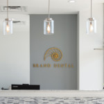
Employing three concepts the trio deemed crucial to a memorable first impression—“logo, modern office design and a staff that sees the value of the patient experience”—they were on their way.
The theme, Dr. Brand says, is “modern coastal,” a nod to the time he and Failor spent in Charleston, South Carolina, when he was chief resident of the Medical University of South Carolina’s AEGD program. “Ultimately, what makes the space work is the square footage,” he observes. “Nothing feels cramped. And patients comment on how comfortable our reception made them feel, how their anxiety went down.”
The hue palette fell into place after the selection of the nautilus to reflect what you might call the Brand brand. “Colors have many effects on patients’ subconscious,” he says. “We chose mainly grays and whites for flooring, walls and cabinetry, then blues and greens as an accent color.”
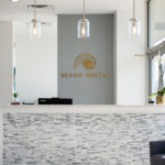
“As soon as a visitor enters, the nautilus logo is the highlight. The palette offers visual interest at the front desk with stacked stone and pendant lighting that doesn’t take attention away from the logo behind.”
Artisan cabinets from Midmark and quartz countertops, Dr. Brand notes, offered upgrades that fit within their preferred color range. Full-spectrum LEDs helped compensate for limitations in natural light, and they use an Amazon Alexa digital assistant as an intercom of sorts “when we need a treatment plan or a patient is ready to be seen.” It all comes together in sacred geometry and Golden Proportions of its own. The nautilus, keeping silent sentry from above the reception desk, no doubt approves.
 Design Tip!
Be as involved in the construction process as possible. There’s often miscommunication between the architectural plans and the contractor, so it’s important to be there to answer questions. It can be minor, such as not having a power outlet where you need it, or something major, such as the flooring pattern or ceiling type.” —Dr. Stephen Brand
The Team
Photographer: Danielle Antonello-Smolley,
triggerfingerphotography.com
Interior Design: Megan Chuzas, Benco Dental
Contractor: LHC Construction
Dental Designer: Mark Costigan
Equipment Specialist: Rich Serafin, Benco Dental
Friendly Benco Rep: Don Sullivan
Online: branddentistry.com


 Instant Karma



 Design Tip!



 Design Tip!

 Design Tip!
