IT WAS NOT so very long ago that the aesthetics of your average dental practice were given no more consideration than, say, the waiting area at your local muffler repair shop. The emphasis was on function, not form: With the right doctor and the right equipment, great dentistry can be performed as easily in a drab mission tent as in the Sis-tine Chapel. Why worry about interiors?
Because a beautiful practice enhances the quality of daily life for doctors, their team members and their patients. Here, for the seventh year running, Incisal Edge has chosen to honor several of the finest dental offices nationwide, and we’ve never been more impressed by the breadth and quality of the spaces we’ve examined.
For 2020, our Competition criteria were the same they’ve always been: We canvassed doctors, equipment specialists, architects and designers across the country for nominations across four categories: Best New Construction, Best Specialty, Best Repurpose and a conceptual Practice of the Future. We then sent all nominations to our blue-
ribbon quartet of judges. They selected our winners and offered thoughts on why each of them merited recognition.
The cold, almost unforgiving sensibility that was the historical hallmark of so many dental practices is on the way out, replaced by the types of practice spaces you’ll see on the pages ahead. The benefit for dentists and patients is evident. Dentistry has always been a noble profession. Now, thanks to interiors like these, it’s a much more refined and elegant one as well.
MEET THE JUDGES

Joyce Bassett
DDS, FAACD, FAGD
Dr. Bassett practices comprehensive restorative and aesthetic dentistry in Scottsdale, Arizona. A 2016 Lucy Hobbs Project honoree for Clinical Expertise, she is a prominent lecturer and author and the founder of the Women Teaching Women Cosmetic Learning Facility. Arizona’s only accredited fellow in the American Academy of Cosmetic Dentistry, Dr. Bassett is now president of that organization.
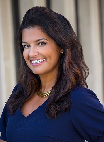
Sabiha Bunek DDS Dr. Bunek is CEO of Dental Advisor and owner of Bunek Dental Studio. After 12 years in a group practice, Dr. Bunek designed a private practice in Ann Arbor, Michigan—right across the street from the “Big House,” the University of Michigan’s famed football stadium. A winner of the Incisal Edge Design Competition in 2019, Dr. Bunek understands the careful planning required to incorporate the principles of design, function and technology, all while maintaining an effective floor plan.
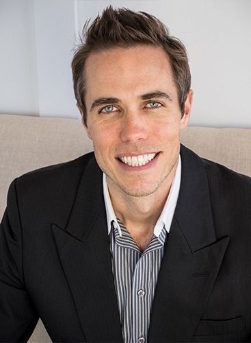
Tristan Hamilton DDS, M. ARCH Dr. Hamilton practiced architecture in Washington, D.C., where he worked on such notable projects as the Las Vegas City Master Plan, Vanderbilt University Master Plan and numerous United States Embassy renovations. He now practices dentistry in North Carolina (in an office he designed himself, which won an Incisal Edge design award in 2013) and at the Church Street Clinic in St. George’s, Grenada.
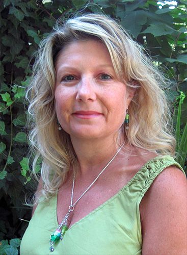
Phyllis Marshall-Rice LEED AP, EDAC Marshall-Rice is the health-care design manager at Herman Miller, where for 27 years she has served in a number of design and design-related training roles. She and her team focus on creative solutions for inpatient, outpatient and administrative facilities. An LEED Associate Professional who is certified in Evidence-based Design Accreditation and Certification, she earned a BFA in environmental design from East Carolina University.

Winning projects in the Incisal Edge Design Competition are selected by a jury of professionals from the worlds of architecture and dentistry. The panel performs a comprehensive review of numerous submissions, including practice photos and floor plans, along with explanations of how each achieves a functional balance of design, operation and technology. Projects not accepted by the jury are not published.
BEST NEW SPECIALTY
DR. Rebecca Wilson
Timberwood Park Pediatric Dentistry
San Antonio, Texas
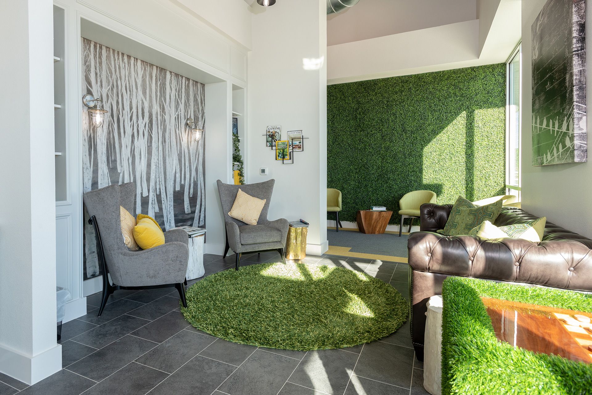
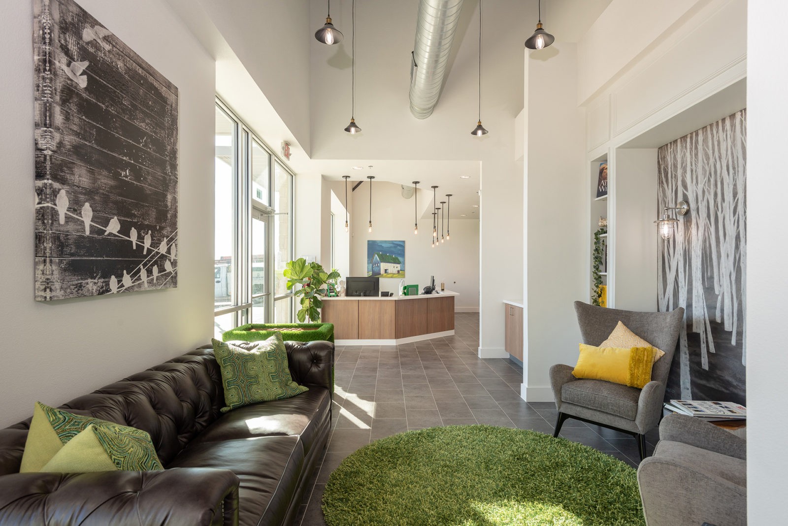
Cool, funky, classy, subtle. The use of colors, grass and artwork draws patients and their parents into the setting.”
—Joyce Bassett, DDS, FAACD, FAGD
A tufted leather couch for a pediatric office? I love it! There’s texture to engage the senses, color to accentuate spaces, centralized storage, high ceilings. What class brought to such youth. Kudos.”
—Tristan Hamilton, DDS, M. Arch.
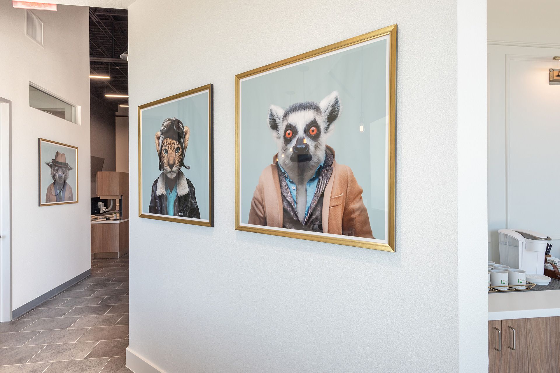
THREE MOTIFS make up the heart of Dr. Rebecca Wilson’s Timberwood Park Pediatric: kids, animals and the outdoors, all of which highlight her new 3,500-square-foot practice in the outskirts of San Antonio.
After a dozen years in her previous office in the city’s Alamo Heights neighborhood, Dr. Wilson reopened last August in a new strip center on the way to Texas’s Hill Country—a step closer, this “Iowa farm girl” says, to fulfilling her goal of returning to the country.
The new practice sits across from an elementary school, providing for an easy influx of young charges. “It’s really good visibility, and a lot of our patients just come by while driving,” Dr. Wilson says.
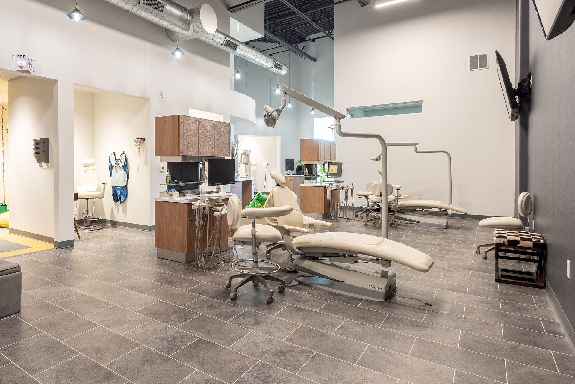
Working with Jim Reed and Jeff Harmon at Benco Dental, Dr. Wilson created a sophisticated yet whimsical, playful space loosely inspired by the high-rise apartments near Piedmont Park in Atlanta, where Dr. Wilson spent time with her kids at the beginning of 2019. The color scheme mixes calming green, upbeat yellow and gray; walls are garlanded with ivy for texture and an outdoorsy feel. “A lot of the design comes from a mom’s perspective,” she notes. “The layout is very open—I want moms and dads to feel like they can move around the office and follow their kids.”
The roomy space took just five months to build out; Dr. Wilson was able to hang her shingle on time and under budget. It offers three quiet rooms, four operatories, a post-op recovery room and a break room. Up front is nice, too. “I love my reception area. It’s calming and comfortable, with a nice leather couch—it has a library feel,” the doctor says. “I like to just sit up there.”
Dr. Rebecca Wilson’s
Specialty Design Tips“Get references on the team you put together: your marketing person, construction manager, realtor, architect. Get feedback from their previous clients. And artwork! Be sure to add that into your budget. Remember, though, that even essentials—mirrors, trash cans, office supplies—can really add up.”
BEST NEW CONSTRUCTION
DR. KYLE BOGAN
NORTH ORANGE FAMILY DENTISTRY
DELAWARE, OHIO
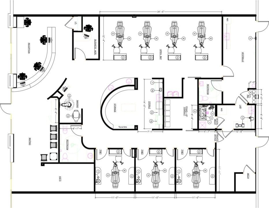
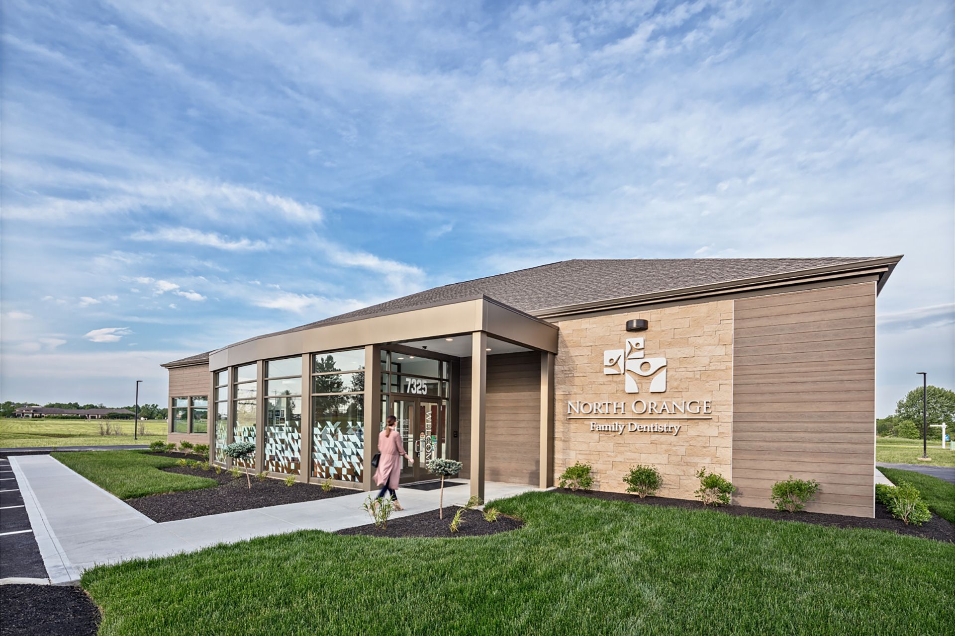
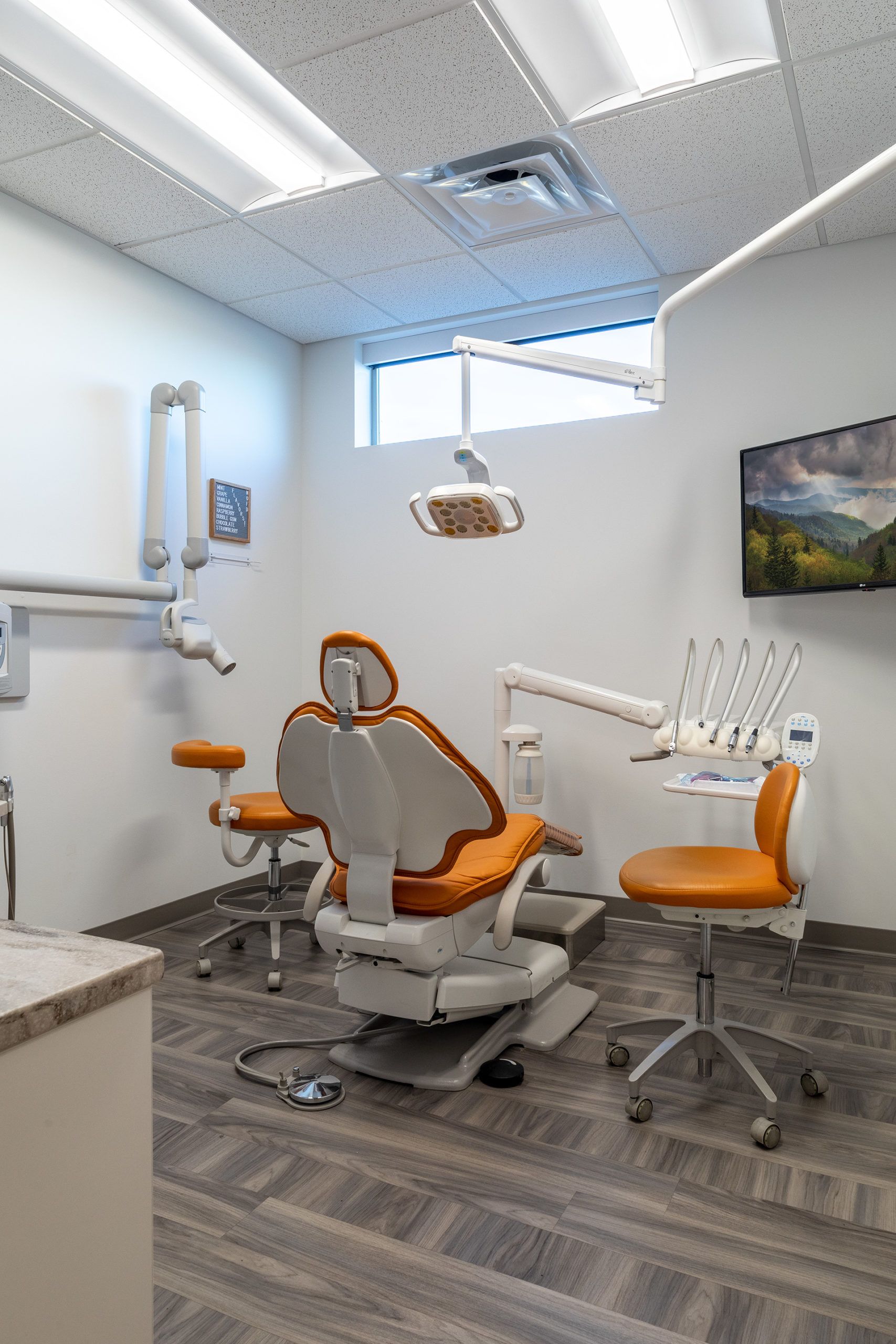
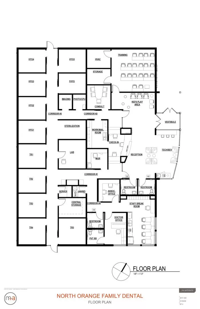
A FELLOW OF the Academy of General Dentistry and the International College of Dentists, Dr. Kyle Bogan, along with his team, is consistently selected among the top dentists in the Columbus, Ohio, area. A serious practice calls for a serious space, and Dr. Bogan wanted his commitment to technology in the service of top-notch dental care to be evident in North Orange Family Dentistry, his astonishing—and, at 5,600 square feet, impressive—new-build practice. “Not only did we want the building to reflect that we’re high-tech and high-touch, we wanted it to be an experience,” Dr. Bogan says.
It’s family-centered and tech-forward. The exterior is inviting; the interior is welcoming, too. A very clean look—warm and modern.”
—Sabiha Bunek, DDS
Selecting the right lot was the easiest decision; The doctor and his team alighted on a two-acre plot in the northern Columbus suburb of Delaware, just a block away from their existing practice but with better street position. Enlisting the help of M+A Architects and Connect CDC contractors (a group of engineers, builders and designers specializing in medical offices) in Columbus, the North Orange team broke ground in September 2018 and opened to the public just eight months later.
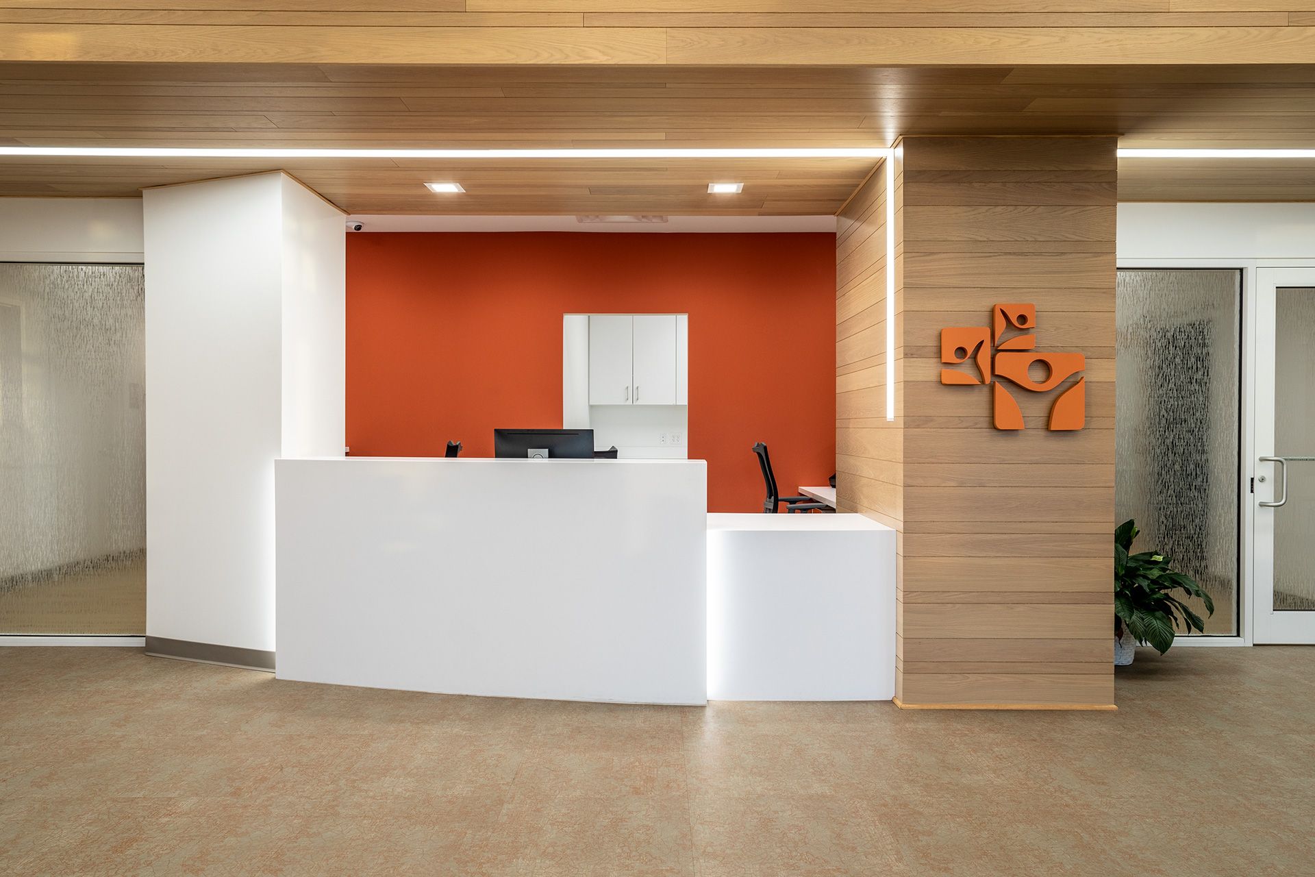
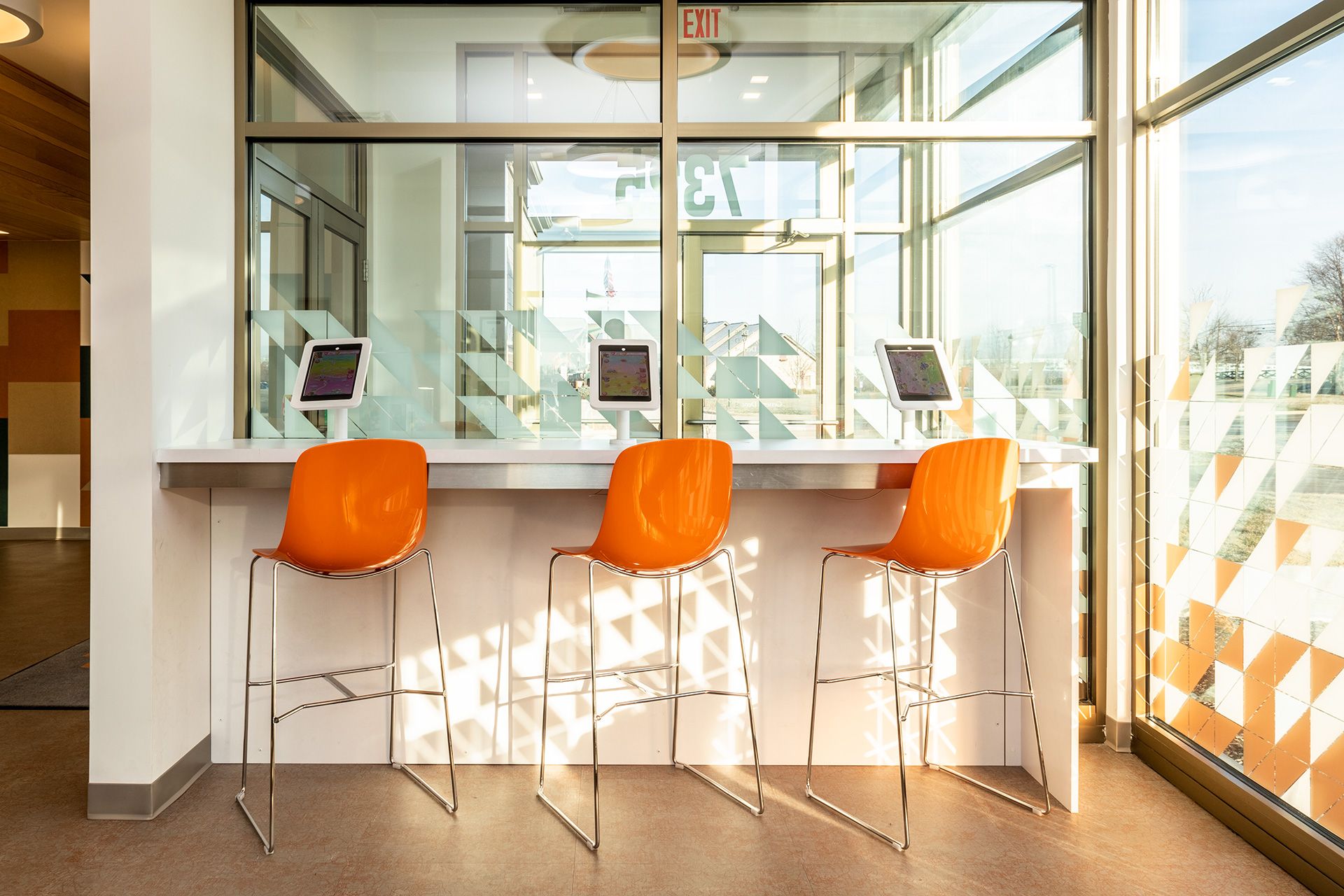
A tech bar with iPads on a white countertop greets visitors at reception; 3D printers and milling and restoration machines, intriguingly, are placed where patients can see them at work. “We looked at technology from a patient and dental standpoint and [wanted to] provide some entertainment,” Dr. Bogan says. “Every aspect of the office has tech that patients can touch or experience.”
In a nod to the practice’s name, orange is woven subtly throughout—in the bar stools at the iPad counter, on accent walls and in lighting fixtures. “Our interior designer brought in complementary colors I wasn’t expecting: gold, teal and beige,” the doctor says. “Our task was to make orange tasteful and not overdone, and I think we accomplished that.”
Finally, the break room, which was the object of considerable attention from Dr. Bogan. It ended up with a set of lockers, a full-size kitchen boasting a refrigerator, dishwasher and microwave, plus bench seating and booths.
The lighting of the entire space is what most animates the doctor and his team. “We put track lighting in the main hallway, and it lines [it entirely],” he says. “It’s also built into the wood columns in the front-desk area. It makes the space unique.”
Dr. Kyle Bogan’s
NEW CONSTRUCTION Tips“Start the process like I did: knowing exactly what you want to come out with. It’s much smoother than if you’re uncertain. Your team will build the practice based on your vision—alter it in any way and you’ll add time and expense. It’s also wise to go with a dental-specific contractor if you have one in your area.”
BEST REPURPOSE
DR. D. BRIAN WILLIAMS
D. BRIAN WILLIAMS DDS
CHARLOTTE, NORTH CAROLINA
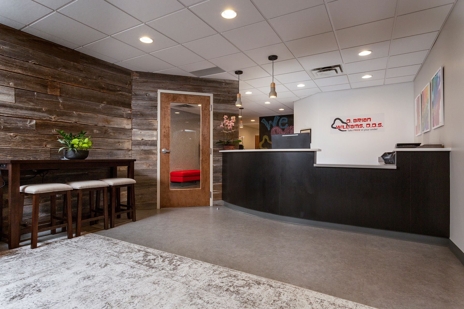
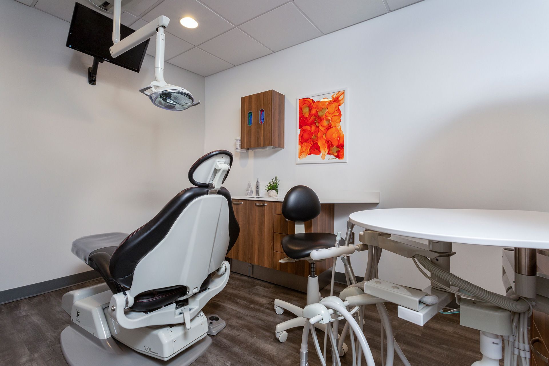
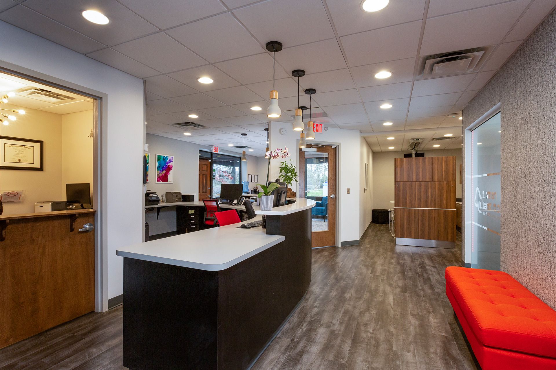
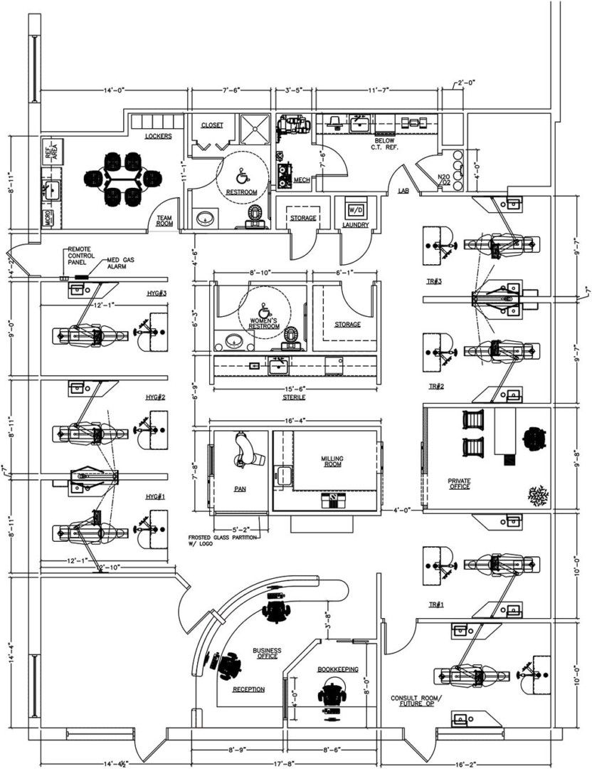
A NATIVE OF Greensboro, North Carolina, and a former Air Force captain, Dr. D. Brian Williams has been the sole owner and practitioner of this general practice in Charlotte for nearly 15 years. In 2018, though, he realized he had outgrown his existing space, an 11,000-square-foot office in a 10-story high-rise in the neighborhood of Eastover. He and his practice manager, Tyler Phillips, then took just seven months to devise the creative framework for a new office space down the street at Eastover Medical Center, where Dr. Williams bought 28,000 square feet from a former pediatric medical practice.
In tandem with Benco Dental’s Peter Stuart, their equipment specialist, Phillips and Dr. Williams put together a top-notch team, working with local Dimensions General Contractors for the build-out and Benco interior designer Monica Hanson for design consultation. “The goal was to have a space that flowed well,” Phillips says. “We wanted it to be welcoming, like people hanging out in a living room.”
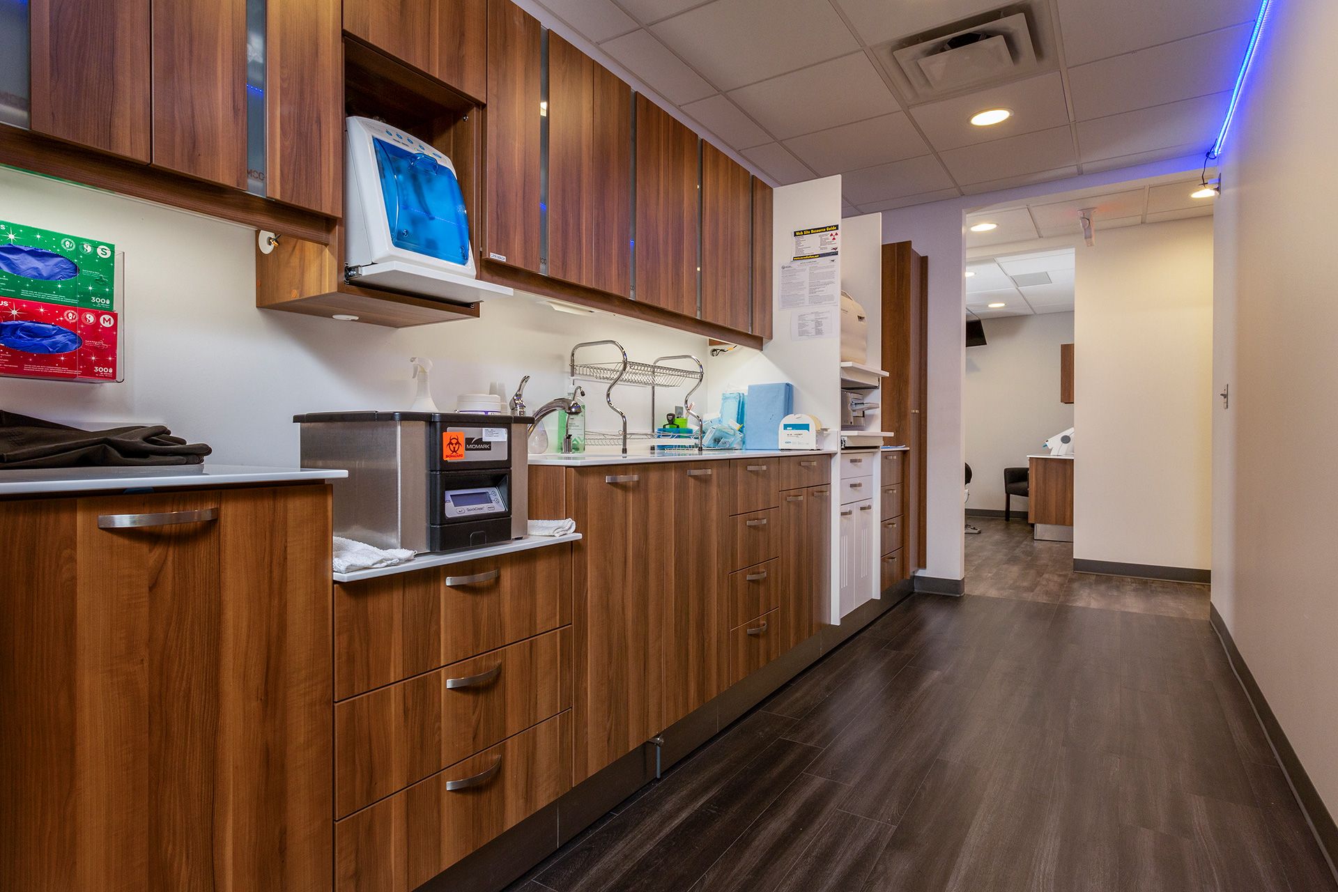
The reception area’s crisp white-and-gray walls mix with an accent wall of reclaimed barn wood and birchwood wallpaper for a homey feel. Black faux-leather seating and deep blue-green vermicelli armchairs add color. One bold choice was eschewing the walls that separate the six operatories, instead positioning cabinetry with white countertops as dividers. “You have dual entry from either side, but at the same time you have enough privacy,” Phillips says. “We really paid attention to detail with the colors and the floor, and how they bring out the colors of the cabinets. That’s one of my favorite things—the whole big picture.”
A good mixture of materials, finishes and 1950s modern with contemporary. A good reflection of the area.”
—Phyllis Marshall-Rice, LEED AP, EDAC
Tyler Phillips’s
REPURPOSING Tips“Talk to colleagues who have been through this, and get input from everyone—what I would have chosen from the get-go was not what would have been best for us. Once I had talked to multiple people and learned what they’d experienced, I was better able to understand why what I had in mind wasn’t going to work. I’m very glad I took that advice.”
PRACTICE OF THE FUTURE
MINGDA LIU
ARTISTIC DENTAL STUDIO • SEATTLE, WASHINGTON
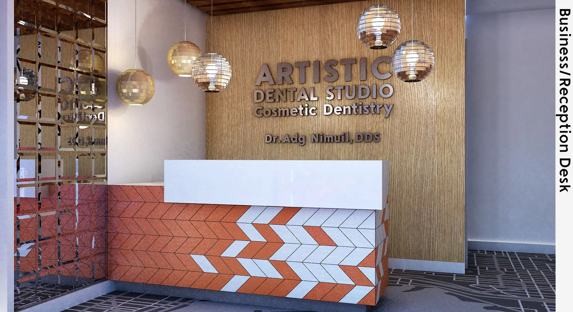
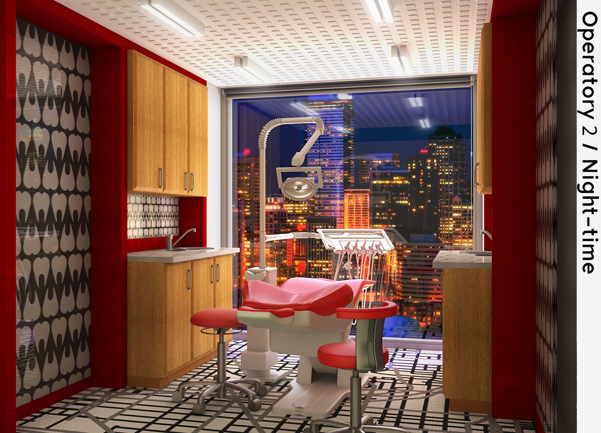
LAST YEAR, Brooklyn-based interior designer Mingda Liu submitted a design for “Fusion Orthodontics and Pedodontics,” an irreverent blend of the quotidian and the futuristic that won runner-up for Practice of the Future. For 2020, he redoubled his efforts with this fanciful “Artistic Dental Studio” that he placed in Seattle despite the fact that he’s never been there. This year’s winner, Liu sat down with Incisal Edge to discuss his creative process—and where dental-practice design goes from here.

A: I believed I could do better in 2020, so I did. I had too many design ideas in the last competition that I didn’t execute well, so I simplified this concept: It’s an artistic dental studio with logical planning, customized materials and photorealistic rendering.
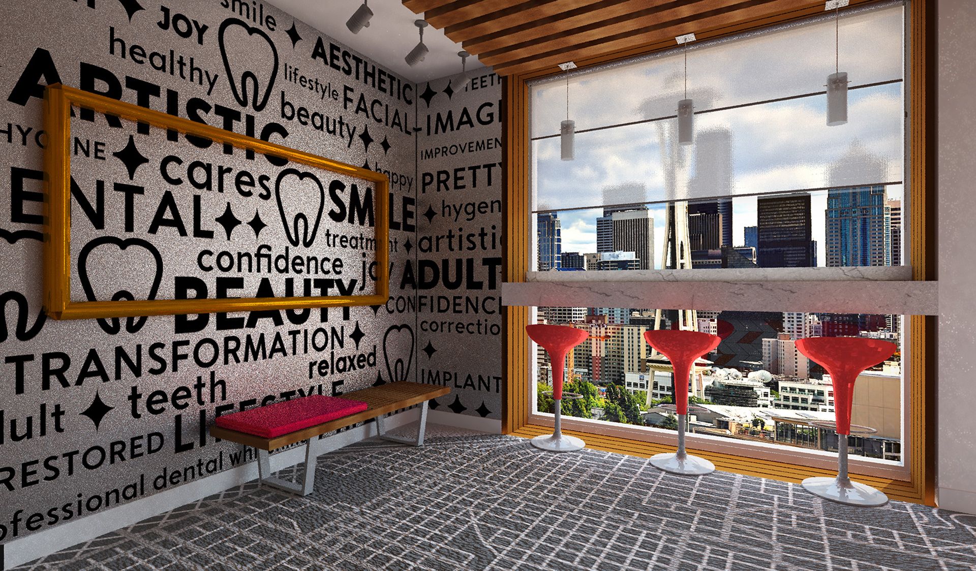
I love the trendy open bar–style seating that enables patients to look out over the beautiful Seattle skyline—day or night.”
—Sabiha Bunek, DDS
What’s unique about this practice design? What makes the space work?
I “de-institutionalized” a typical dental-care facility and turned it into an artistic space combining a gallery and open bar—certainly a more relaxed and inviting environment. The metal art frame draws attention to the custom dental-themed wall covering, instantly making anyone sitting on the bench part of the artwork. Floor-to-ceiling windows with wooden frames abstractly become an enlarged shadowbox art piece as well. The reception area and all operatories have spectacular, unobstructed skyline views—which for sure can positively affect patients and a practitioner’s outcomes.
What advice would you offer architecture and interior-design students who are just starting out?
Always challenge yourself; push the limits and push the boundaries. You’ll be amazed what you can accomplish. And, of course, do everything you do for the right reasons.
Which specific features or equipment did you include? Did you plan this to accomplish certain objectives?
To make the layout logical and efficient for both patients and practitioners, the reception space and all operation rooms are lined up with full-length windows—again, ones that feature the skyline view. The rest of the space, on the opposite side, is divided by a common hallway.
What attracts you to dental-practice design in the first place?
As in other fields, design for the dental industry is constantly evolving, with innovative products and equipment that help promote good patient experiences, better care and employee productivity. I look forward to discovering more about dental-specific design in the years ahead.
PRACTICE OF THE FUTURE
RUNNER-UP
NINA CIARLA
SEATTLE DENTISTRY
DRUMS, PENNSYLVANIA
CIARLA ALSO set her practice in Seattle, creating what she calls “a holistic approach to dentistry by touching on the beauty of the natural landscape.” Elements of wood, grass and gray pebble tones help erase the distinction between the practice and the outdoors.



 Dr. Rebecca Wilson’s
 Dr. Kyle Bogan’s
 Tyler Phillips’s
 CIARLA ALSO set her practice in Seattle, creating what she calls “a holistic approach to dentistry by touching on the beauty of the natural landscape.” Elements of wood, grass and gray pebble tones help erase the distinction between the practice and the outdoors.
