
One running theme of the Incisal Edge Design Competition over the years has been to call attention to
THE STARK DIFFERENCE between the featureless, often downright unpleasant-to-spend-time-in dental practices of yore and today’s magnificent medical emporia. The new ones aren’t just a nicer environment for patients but also offer a doctor’s team an elegant, enjoyable space in which to work.
Our criteria for design excellence have remained essentially the same over the nine years we’ve been conducting this competition: We canvass doctors, equipment specialists, architects and designers around the country for nominations across three categories: Best New Construction, Best Repurpose and Best Specialty. We send all nominations to our blue-ribbon panel of four judges (below), all of whom have extensive experience in practice design. This keen-eyed foursome then select the winners and share their thoughts on why each merits inclusion.
The quartet of practices on the pages ahead—one category ended up in a tie at the top of the heap—make clear that aesthetically, there’s no turning back. The last decade-plus has been a golden era for dental office design, one we’re proud to have helped chronicle every step of the way.
MEET THE JUDGES

Dr. Bassett practices comprehensive restorative and esthetic dentistry in Scottsdale, Arizona. A 2016 Lucy Hobbs Project honoree for Clinical Expertise, she is a prominent lecturer and author and the founder of the Women Teaching Women Cosmetic Learning Facility. Arizona’s only accredited fellow in the American Academy of Cosmetic Dentistry, Dr. Bassett is now president of that organization.
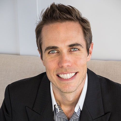
Dr. Hamilton worked at an architecture firm in Washington, D.C., where he collaborated on such notable projects as the Las Vegas City Master Plan, Vanderbilt University Master Plan and various United States Embassy renovations. His design work has appeared in many publications; he also won an award for best overall practice design fromIncisal Edge. He practices in Hendersonville,
North Carolina.

Dr. Lyons earned his dental degree from Meharry Medical College in Nashville and currently practices at Smile Savvy Cosmetic Dentistry in Charlotte, North Carolina. He and his wife, Dr. Joya Lyons, practice in tandem and are the founders of The Lyons Share charitable foundation. Dr. Lyons has lectured about dental-practice design, esthetics and interior flow to industry groups across the United States.

Marshall-Rice is the health-care design manager at Herman Miller, where for 29 years she has served in a number of design-related training roles. She and her team focus on creative solutions for inpatient, outpatient and administrative facilities. An LEED Associate Professional who is certified in Evidence-Based Design Accreditation and Certification, she earned a BFA in environmental design from East Carolina University.
BEST NEW CONSTRUCTION
Cornerstone Dental Group | Harrisburg, North Carolina
Dr. Tin D. Lam
Contractor: Whitley Construction
Architect: Urban Architect Group
MEP: Whitley Construction
Dental Designer: Angèle Hashoul
Interior Designer: Angèle Hashoul
Equipment Specialist: Scott VanLant
Photography: Aerophoto America; aerophotoamerica.com
Clean layout, and modern. Great splashes of color.” —Andrew Lyons, DDS
A FAILING SUCTION MOTOR would seem unlikely to provide a spark of inspiration. For Dr. Tin D. Lam, though, the faulty device would, over time, lead to an entirely new, up-from-the-ground dental practice.
At the time, he was in a space better suited to the Reagan era, struggling to find a way to update his equipment and office design without interrupting the care of his patients at Cornerstone Dental in Harrisburg, North Carolina, a northeast suburb of Charlotte. The suction motor was the canary in the coal mine: As other equipment began to peter out, Dr. Lam determined it would be more cost-effective, and less painful, to do a full new build.
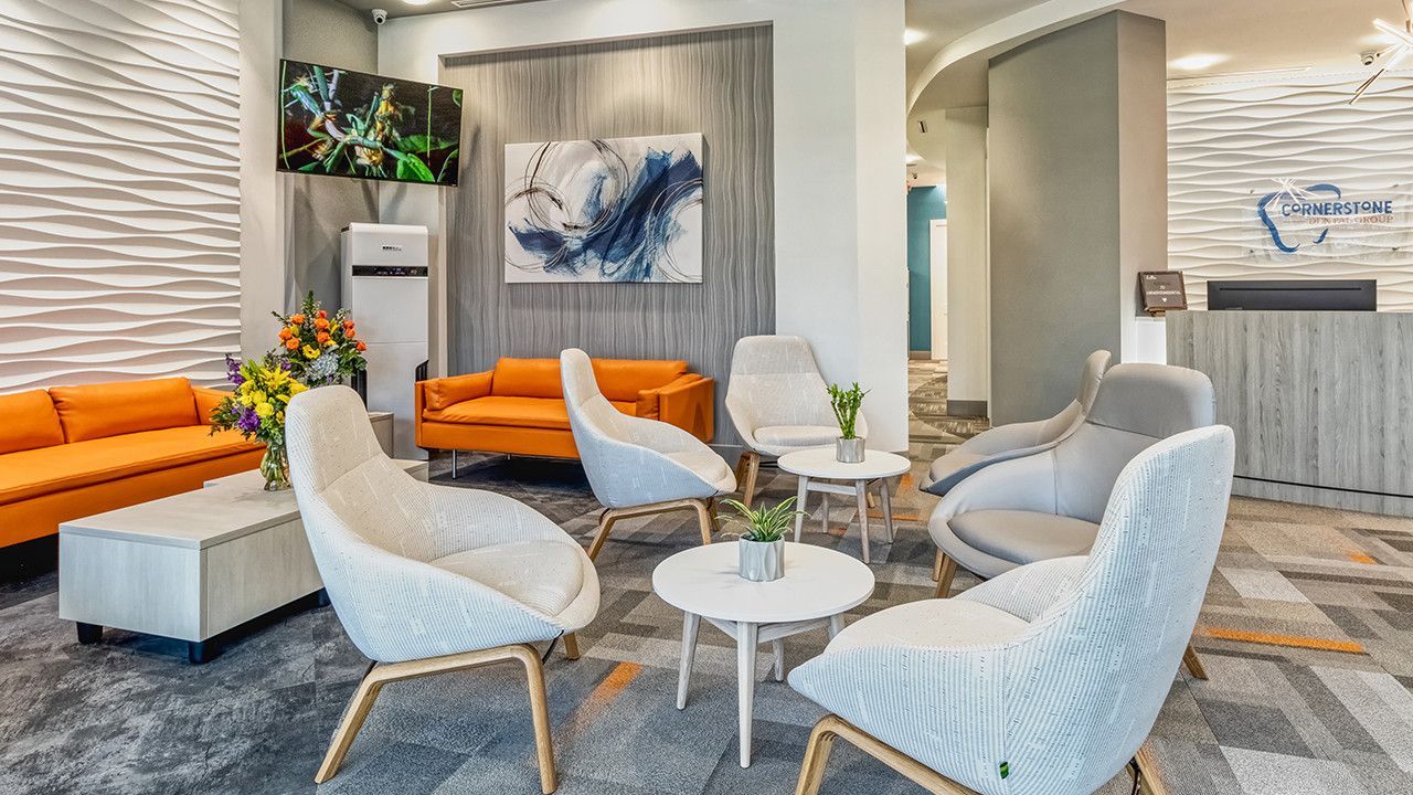
The result, this stand-alone, 5,000-square-foot, 12-operatory edifice, cost roughly $2.9 million (including new equipment). The shared vision of Dr. Lam and his interior designer, Angèle Hashoule, encompassed a spacious office with airy 12-foot ceilings to combat patient claustrophobia. Matching arches in the floor and ceiling add to the plein-air quality of the surroundings, while less attractive elements—machine and utility rooms, for example—were tucked safely out of public view.
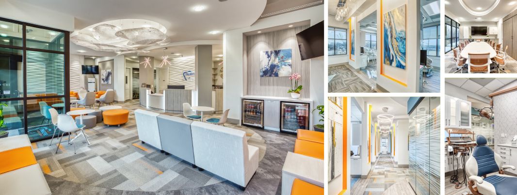
Colors and shapes: A riot of bright hues, complex patterns, etchings and fixtures together create a vibrant whole.
The marriage of efficiency and aesthetics is what makes Dr. Lam proudest of his new space, which opened in March 2021 after two years of construction. It’s “designed like a racetrack,” he says, “to ensure efficient ingress and egress for patients and staff, and to centralize equipment, supplies and sterilization for all operatories.” Everything a doctor or hygienist might need is within reach of the operatory chair, he notes, adding that he and his design team placed the consult room close to the business office to further streamline operations.
As for those aesthetics: The cool blues and mixed metals and woods throughout Cornerstone Dental Group exude visual calm—a result that took a bit longer, and cost a little more, than Dr. Lam had accounted for. The design, while beautiful, was built on “bad soil”—a problem, he discovered, that had long plagued the area. Ensuring structural integrity tacked on an additional four months and $150,000. Regardless, the finished product is well worth it, paying daily dividends for patients and team members alike. “The entire office, from hallways, consult rooms, sterilization and treatment rooms, were designed with colors, patterns and visual features that subtly [show] elegance and excellence,” Dr. Lam says. “The idea is to make [patients] comfortable and forget they’re in a dental office.”
Dr. Tin D. Lam’s
New-Construction Tips
Comprehensively survey your land before getting started—you don’t want later to discover you’re atop ‘bad soil.’ Then plan ahead, stay involved, inspect every inch of the way—and budget an additional 15 percent over what you think it will cost. Also realize it may take twice as long as you think, or as has been promised.”
BEST REPURPOSE
Carolina Dental | Matthews, North Carolina
Dr. Tara Howell
Contractor: Rick Whitley with Colony Builders
Architect: Michael Weslake
Interior Designer: Tina Segal with House of Nomad
Equipment Specialist: Scott VanLant
Photography: Jim Schmid; jimschmid.com
A clean, crisp look and finishes, softened by the use of the focal art pieces from around the world. There’s a warmth and interest here that makes this unique.” —Phyllis Marshall-Rice, LEED AP, EDAC
IN MAY 2020, not long after Covid-19 had first sunk its teeth in nationwide, Dr. Tara Howell purchased a shell of a building, a former law office that had sustained significant fire damage a year earlier. She envisioned a bright, revamped life for the space as the second location of her expanding practice, Carolina Dental—but was her timing inauspicious?
The building’s rebirth remained on hold for five months until that October, however, as Dr. Howell waited for city permits to clear and the trajectory of the pandemic to become more predictable. Not one to stay idle, though, she used the enforced downtime to scrutinize her floor plan, deciding ultimately to expand the reception area to allow for better social distancing.
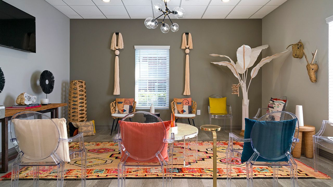
The additional room is anything but cold. Carolina Dental’s boho-chic reception-area aesthetic is redolent of settling into a friend’s living room for tea: Warm fabrics, woven reed chairs and matching wall hangings feel distinctly nonmedical. Dr. Howell carefully curated the practice’s airy overall sensibility with interior designer Tina Segal, of Charlotte emporium House of Nomad, to bring a sense of peace, calm and “home” to her patients. “The House of Nomad design team travels the world to bring modern, eclectic style to any setting,” Dr. Howell says. “Tina really understood my vision and made the space feel modern and cozy at the same time. When you walk in the door, the office is warm and welcoming. I wanted it to feel bright and spacious—a no-fuss atmosphere.”
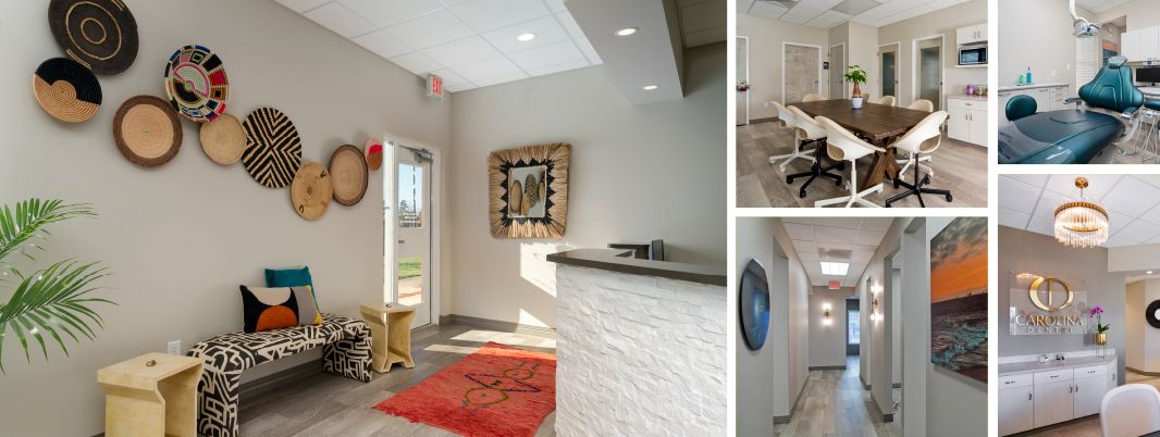
Carolina in my mind: The all-important team room (top left) and other areas of the practice
Originally slated to cost about $400,000, the repurpose came in roughly $50,000 over budget, with aspects of the plan changing throughout development. (It opened its doors to patients in December 2021.) Workflow and efficiency were top priorities for Dr. Howell and her construction team and architect alike. In the end, the doctor’s goals for the 2,900-square-foot office were met, including space for a team room large enough to one day house a dental-assistant school. A former active-duty military dentist in the U.S. Army, Dr. Howell credits her post-service professional success to the exemplary mentors she had every step of the way. “I was adamant about the team room,” she says. “My goal is to train people and introduce them to the world of dentistry.”
Dr. Tara Howell’s
Repurposing Tips
In the early stages, thoroughly study and critique your floor plan. My construction manager kept pointing out little things that could be fixed for better efficiency. Also, pick a company that specializes in dental-office construction. The right team will cause less stress and turmoil.”
BEST SPECIALTY (TIE)
Smile Suite Orthodontics | Evanston, Illinois
Dr. Kimberly Mays Smith
Contractor: Apex Design Build
Design, Architecture, and Construction: Apex Design Build
Equipment Specialist: Shane Kolata, Midway Dental
Photography: Peter Tsai; petertsai.photography
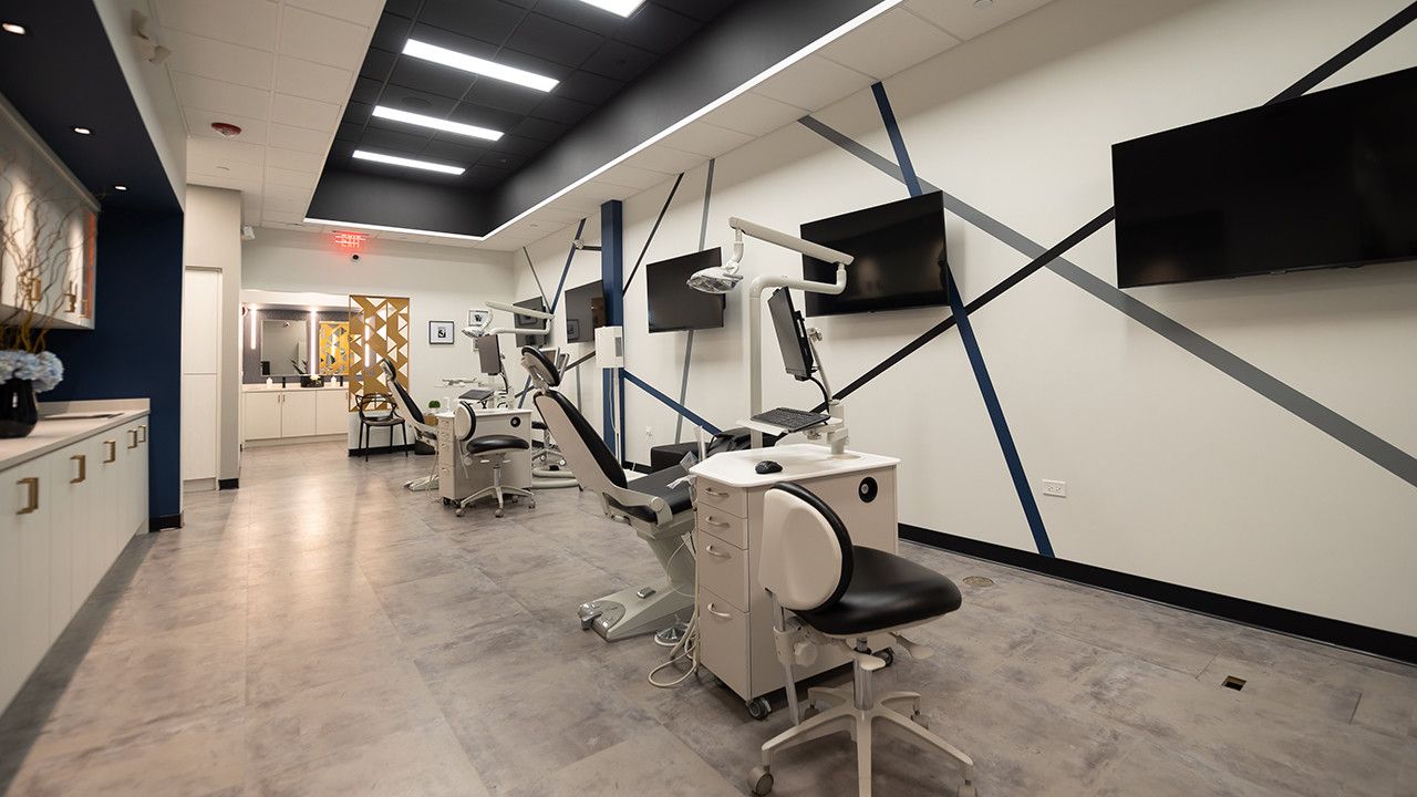
STEPPING THROUGH the doors of Dr. Kimberly Mays Smith’s office feels more like ambling into a posh boutique hotel than an ortho office. Located in Evanston, Illinois, just a bicuspid’s throw from O’Hare Airport, Smile Suite Orthodontics makes a grand first impression with the vaulted black ceilings, polished gold accents and luxurious materials in various shades of blue that mark its reception area.
The look that produces this four-star ambience was all by design, Dr. Mays Smith says. Appearance mirrors experience, she adds: “A beautiful office space can set the tone for what lies ahead. It should embody the same level of excellence that each patient should experience.”
The 2,057-square-foot office took just four months to build, coming in at around $352,000. The project began soon after the pandemic did, but Dr. Mays Smith used the virus-mandated construction delay to ensure that her practice would operate as seamlessly as possible upon opening. Instead of installing all five dental chairs right away, for example, she began with just two. She placed acrylic protection barriers at the reception desk and installed a wireless thermometer unit and hands-free sanitation stand, as well as a Novaerus plasma coil air-filtration unit.
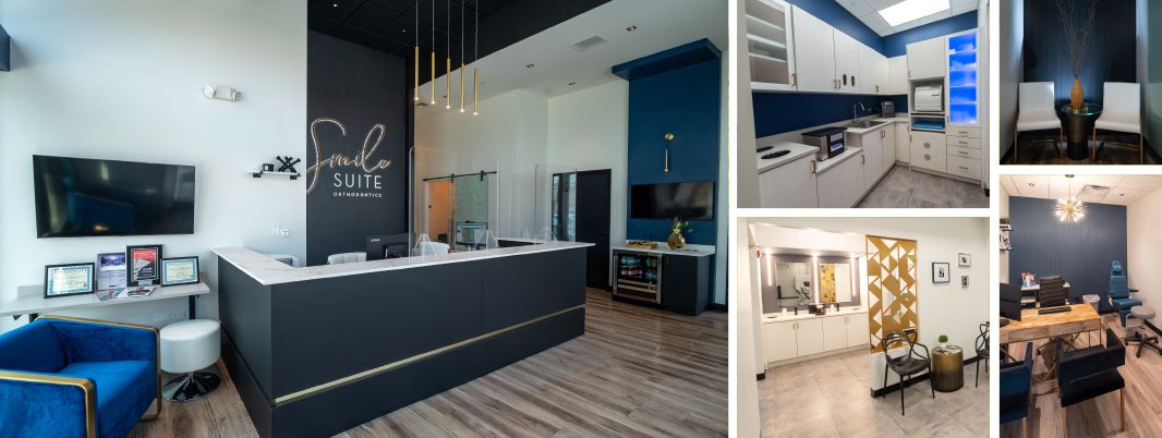
Golden hour: The two dominant color schemes are brought together throughout the practice space.
State-of-the-art technology extends even deeper within Smile Suite’s four walls: The practice uses low-radiation 3D imaging and an iTero intraoral scanner to boost patient comfort. All of Dr. Mays Smith’s office systems are touchless, greatly lessening the amount of paper to be pushed over the course of a day. The large staff room, with lockable storage cabinets, is an employee favorite, while a private treatment room offers greater discretion to patients who need or request it.
Visually, Smile Suite is a riot of bold cobalt blues and rich yellows. The gold barrier wall that separates the photography area from an open bay is sculpture worthy of a museum. Nearly every room features intricate, strategic use of illumination: Downlighting, backlighting, recessed and linear-inset lighting all contribute to the overall air of sophistication. “Smile Suite is a boutique modern practice that incorporates the latest technology in order to deliver the highest-quality care,” Dr. Mays Smith says. Aesthetically and medically, we’d say it succeeds.
Dr. Kimberly Mays Smith’s
Specialty Design Tips
First, consider the patient experience and establish the branding message you wish to communicate. In many instances, a patient’s first impression of your services will be based on the appearance of your office design and their encounters with your staff.”
BEST SPECIALTY (TIE)
Smiley Implants | Riverside, California
Dr. Mohamed A. Hassan
Contractor: CMM Construction
Architect: Saunders & Wiant Architects
Interior Design: Jolanta Interior
Photography: Matthew Reiter; matthewreiter.com
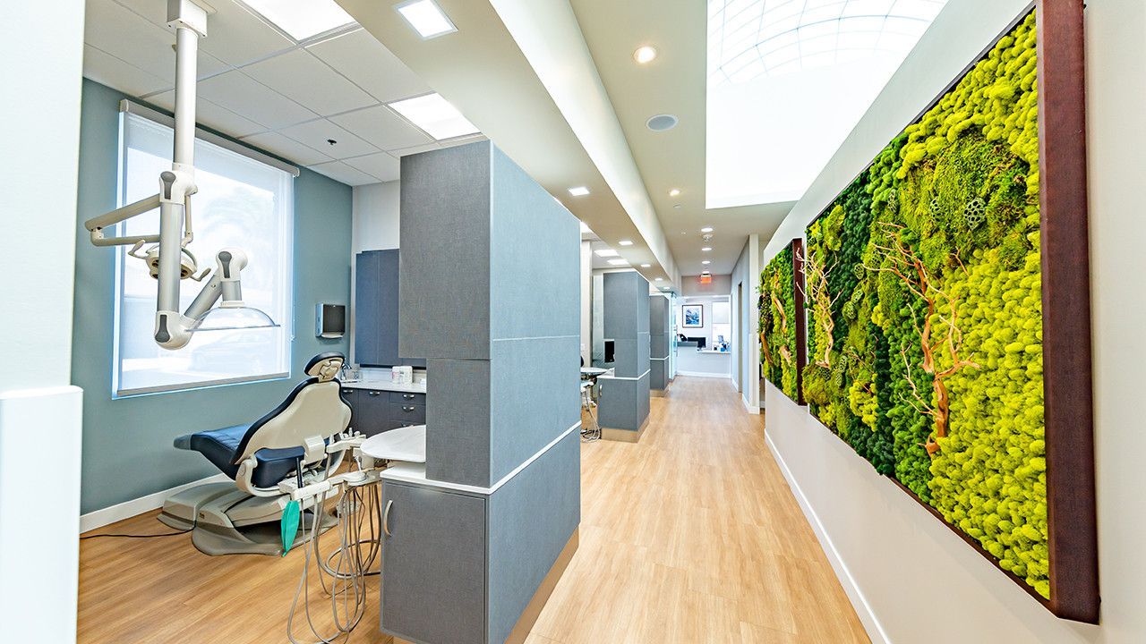
The airy hallway is beyond gorgeous. The rounded shapes of the surfaces make the energy flow, and the bold colors really make the space pop.” —Joyce Bassett, DDS, FAACD, FAGD
EVERY HUMAN SENSE will find something to pique its interest inside Dr. Mohamed A. Hassan’s Smiley Implants. There’s the visual and auditory rush of the enormous wall-mounted water fountain, the mood-elevating sunshine streaming through the 40-foot-long arched skylight and the beautiful sight and olfactory pop of the spectacular living wall, which helps organically purify the interior air. Medically the Riverside, California, space is a marvel as well: Dr. Hassan’s 2,800-square-foot periodontics and implant office features seven modern operatories, as well as a separate four-operatory practice for a general dentist next door.
Although the $2 million project was nearing completion when the pandemic emerged—the main structure and plumbing were in place—Dr. Hassan and his design team, perhaps inevitably, struggled to wrap it up. “The major challenge was the availability of construction workers and the ability to have them work in a safe environment,” he says. “Final finishing components, shipping delays and city permits took ages to approve.”
Ultimately, Smiley Implants required an additional 12 months to complete: It opened in March 2021 after two and a half years of hard work. Fortunately, Dr. Hassan’s existing office was just across the parking lot from his new build, enabling him to oversee the project with ease.
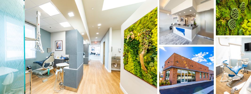
Brick house: The practice’s compact exterior (above) only hints at the aesthetic riches within.
It was certainly worth the wait. The practice’s eco-friendly design effectively brings the natural beauty of Riverside— just east of Los Angeles—indoors. Dr. Hassan and his team sought above all to help patients relax during their visits, placing soothing elements and nuances of nature throughout the inviting space.
The office is shaped like a large U, with the living wall stretching through the center of the space. Natural light and energy-efficient (not to mention just plain old efficient) design were prime considerations, with hygienists’ operatories up one side of the U and doctors’ ops up the other. “These elements in general help to instill comfort and relaxation in our patients,” Dr. Hassan says. “Some patients may fear the dentist. To ease these fears, I added to the floor plan plenty of exterior light, the waterfall, foliage and openness.”
Dr. Mohamed A. Hassan’s
Specialty Design Tips
Do your homework when it comes to selecting your contractor and other key players. Finding a team I could trust, who were willing to accommodate my suggestions and inputs, was the biggest help by far in the entire process.”


 Dr. Tin D. Lam’s
 Dr. Tara Howell’s
 Dr. Kimberly Mays Smith’s
 Dr. Mohamed A. Hassan’s