SQUEEZED FOR SPACE? YOU’RE NOT ALONE. HERE’S HOW THREE PRACTITIONERS BUILT OR RECONFIGURED THEIR PRACTICES, ALL OF THEM UNDER 2,000 SQUARE FEET, INTO MODELS OF EFFICIENCY — WITHOUT SACRIFICING AN IOTA OF QUALITY PATIENT CARE.
BY KRISTIE CERUTI

“The impression patients get allows them to make a deci-sion on choosing the practice,” says the 38-year-old Diplomate of the American Board of Periodontology. “I wanted something warm and different, but not weird. Something associated with the memory of a positive feeling.”
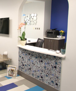
Morning Rays, a lush mural by artist Matthew Lew (page 62, at left), gets patients’ positivity going from the minute they walk into the 1,698-square-foot practice, just north of Atlanta. The color choices throughout — many shades of Dr. Bezreh’s favor-ite color, blue, as well as pops of orange in the cabinetry, on the walls and other places — were abetted by lead designer Megan Chuzas, of Benco Dental’s CenterPoint Design; they help enliven the compact space. Creative, artistic flooring — “floating” luxury vinyl tile — do so as well.
“I could see exactly what I wanted before we even started; I just needed someone to help me express it as something visual, and Megan did that perfectly,” Dr. Bezreh says. He adds that “the feel of the place, the coziness and the color scheme” doesn’t just suit him aesthetically; it had an unexpected professional benefit as well. “The design was adventurous for me,” he says, “but it ended up giving me more confidence.”

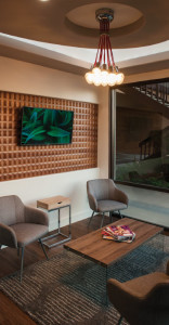
“My practice name, Harbor Modern Dentistry, matches my taste in interior design and my philosophy in the treatment I provide, which is based on biomimetic dentistry,” says Dr. No, 34. He and his designer, CenterPoint Design’s Greg Marinelli, chose a combination of warm wood tones for the flooring, re-ception desk and custom millwork. For balance, they select-ed white and deep gray as the main wall colors; a diamond- pattern wall covering in spots adds geometric vibrancy and depth to the compact space.
Lighting helps in that regard, too: LED cove lighting is built into the recessed ceiling, and two large industrial light fixtures illuminate via striking exposed-filament LED bulbs. Unique soffit shapes add visual interest (and a sensation of additional square footage) overhead. In all, it’s a seamless marriage of form and function, put together with the clientele in mind. “I always imagine myself as a patient,” Dr. No says. “I’m very proud of the space as a whole.”

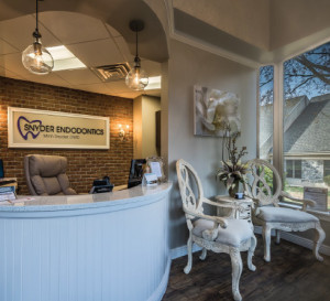
Her Lancaster, Pennsylvania, practice certainly delivers, packing a variety of comfortable aesthetic touches into just 1,598 square feet over two floors. Her partnership with lead designer Amanda Griffith, of Benco Dental’s CenterPoint De-sign, was fruitful. “I wanted wood flooring, barn doors, pretty tiles on the ceiling,” Dr. Snyder says. “Amanda drew the pic-tures and had it all custom-made.” Shabby-chic furniture, exposed brick, neutral wall colors and beautifully rustic illumi-nation help complete the look.
One unusual challenge vexed Dr. Snyder from the outset: “I wanted it to look feminine, because it’s more calming than a space of hard surfaces,” she says, “but I was concerned it wouldn’t be palatable to my male patients.” She got reassur-ance during the two-month construction period from a per-haps surprising source: the broad-shouldered men doing the work, who discussed with her their desire to incorporate simi-lar design elements in their own home decor. Says Dr. Snyder: “I took that as a great compliment.”


