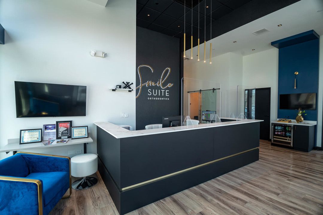
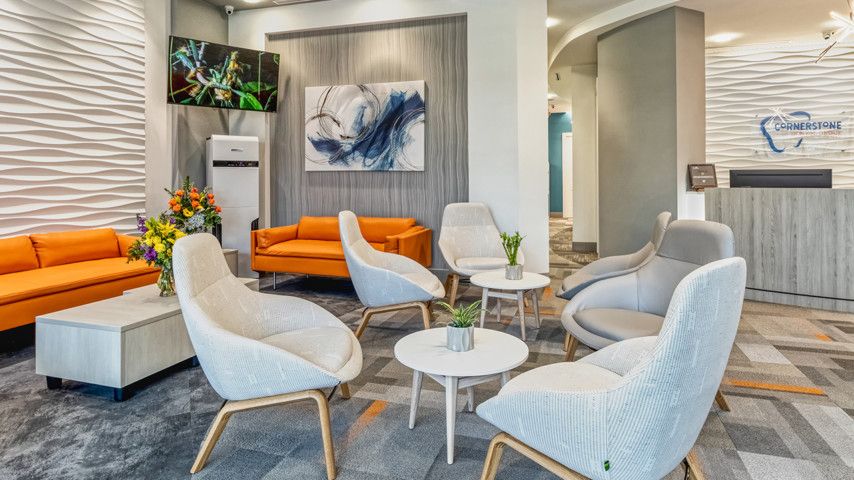
STEPPING THROUGH the doors of Dr. Kimberly Mays Smith’s office feels more like ambling into a posh boutique hotel than an ortho office. Located in Evanston, Illinois, just a bicuspid’s throw from O’Hare Airport, Smile Suite Orthodontics makes a grand first impression with the vaulted black ceilings, polished gold accents and luxurious materials in various shades of blue that mark its reception area.
The look that produces this four-star ambience was all by design, Dr. Mays Smith says. Appearance mirrors experience, she adds: “A beautiful office space can set the tone for what lies ahead. It should embody the same level of excellence that each patient should experience.”
The 2,057-square-foot office took just four months to build, coming in at around $352,000. The project began soon after the pandemic did, but Dr. Mays Smith used the virus-mandated construction delay to ensure that her practice would operate as seamlessly as possible upon opening. Instead of installing all five dental chairs right away, for example, she began with just two. She placed acrylic protection barriers at the reception desk and installed a wireless thermometer unit and hands-free sanitation stand, as well as a Novaerus plasma coil air-filtration unit.
Dr. Kimberly Mays Smith’s Specialty Design Tips
First, consider the patient experience and establish the branding message you wish to communicate. In many instances, a patient’s first impression of your services will be based on the appearance of your office design and their encounters with your staff.”
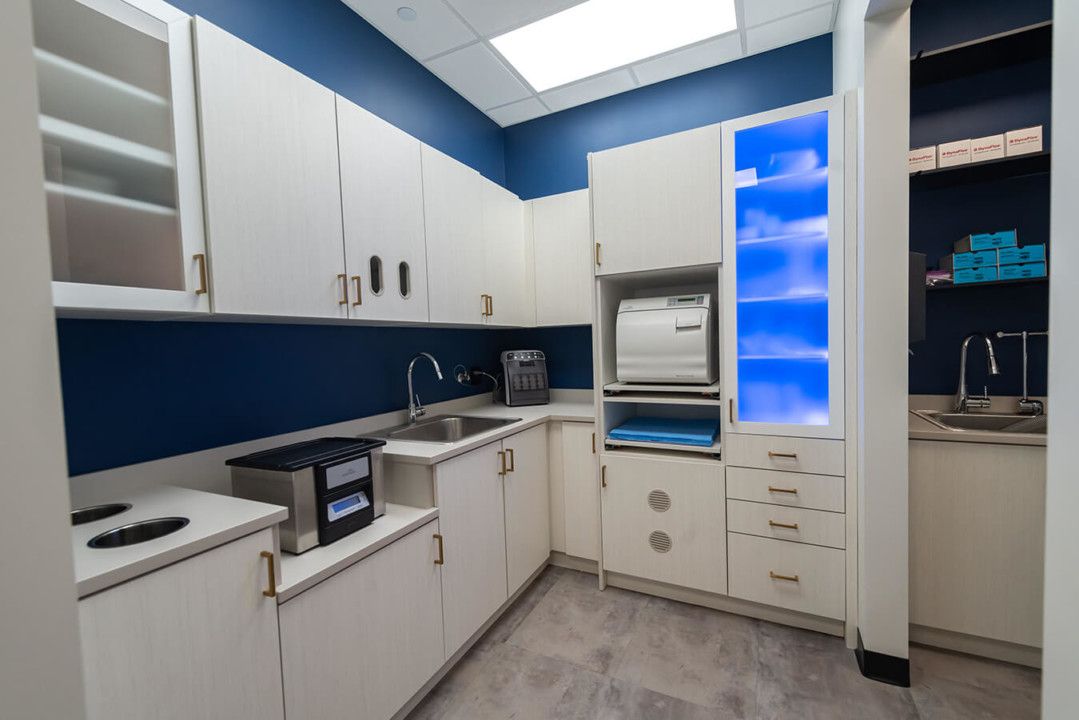
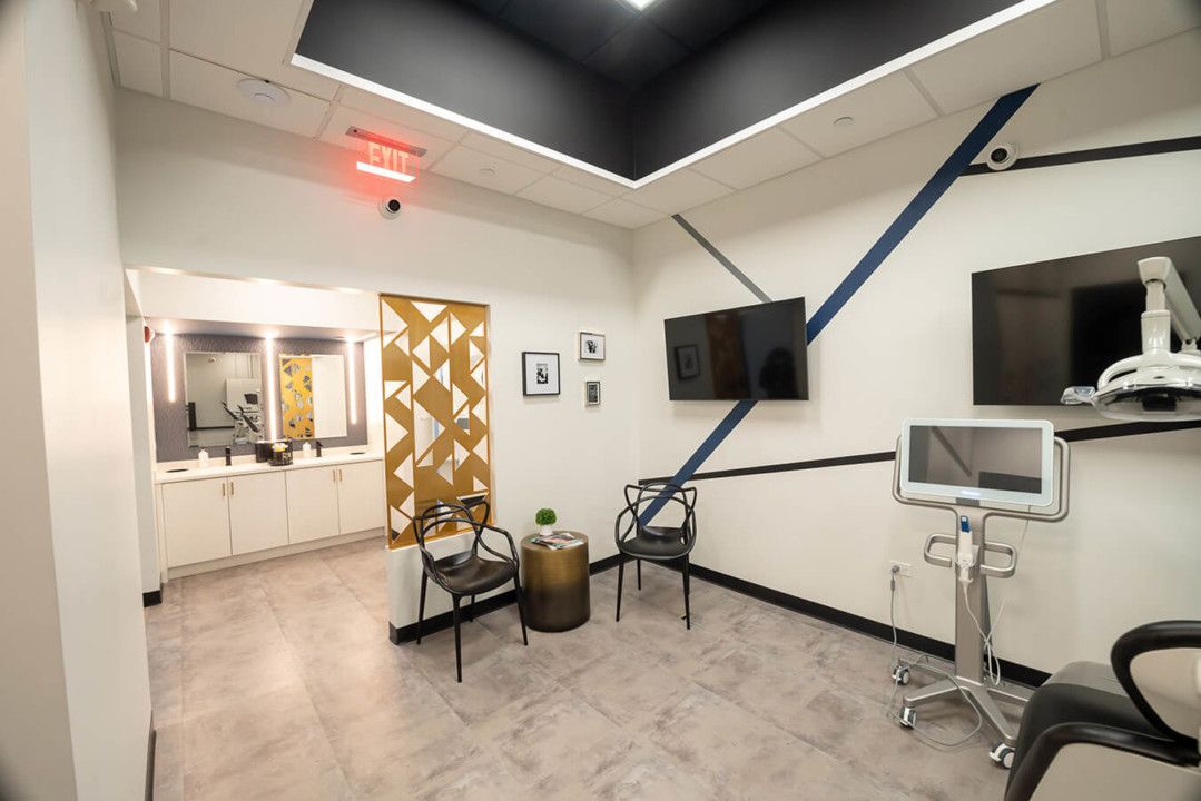
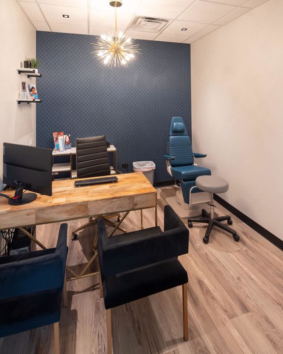
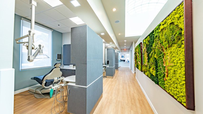
State-of-the-art technology extends even deeper within Smile Suite’s four walls: The practice uses low-radiation 3D imaging and an iTero intraoral scanner to boost patient comfort. All of Dr. Mays Smith’s office systems are touchless, greatly lessening the amount of paper to be pushed over the course of a day. The large staff room, with lockable storage cabinets, is an employee favorite, while a private treatment room offers greater discretion to patients who need or request it.
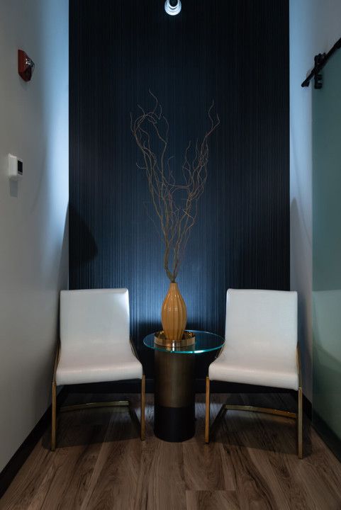
Visually, Smile Suite is a riot of bold cobalt blues and rich yellows. The gold barrier wall that separates the photography area from an open bay is sculpture worthy of a museum. Nearly every room features intricate, strategic use of illumination: Downlighting, backlighting, recessed and linear-inset lighting all contribute to the overall air of sophistication. “Smile Suite is a boutique modern practice that incorporates the latest technology in order to deliver the highest-quality care,” Dr. Mays Smith says. Aesthetically and medically, we’d say it succeeds.


